Redesigning the Boys Champions Dashboard
I started by mapping out the dashboard’s purpose and requirements. This meant working closely with the Boys Champions team to understand their workflows, pain points, and must-have features. Once the big picture was clear, I planned the user flows, tackling the most critical parts first.
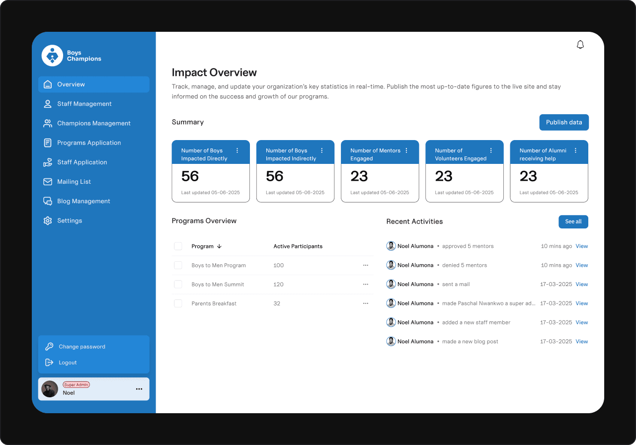
Overview Page: A Central Command Center
The first priority was the Overview page: a single place to see key metrics and activities at a glance. I asked: “What does a user need to know instantly?” This shaped what data to show and how to prioritize it, making the page both informative and actionable.
Overview page

Staff Management: Simplifying Team Oversight
Next, I built the Staff Management section to handle all team roles in one place — Staffs, Mentors, and Admins. Even though only Staffs and Mentors appear publicly, including Admins here made internal management seamless.
To make it easy to update and organize, I added clear “New” and “Rearrange Order” actions. The latter came from an insight: users often need to control how staff appear on the site.
Staff management page

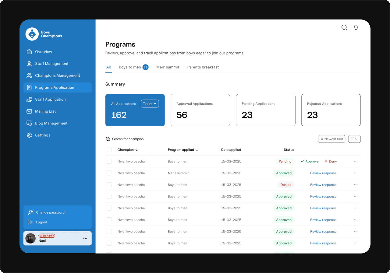
Application Management: Streamlining Screening
One of the dashboard’s core jobs was managing applications for different programs. To keep it smooth:
I used a tabbed view so users can switch between program categories easily.
Each tab shows a count of pending applications for quick awareness.
Added a quick-view summary and a detailed table with instant approve/deny buttons.
Included a “review response” option to fix mistakes — ensuring flexibility and accuracy.
Application management page

Final Thoughts
This is just a snapshot of the dashboard design process — every decision came from understanding real user needs and simplifying complex workflows. I’d be happy to share more details or walk through the full project if you’re interested.
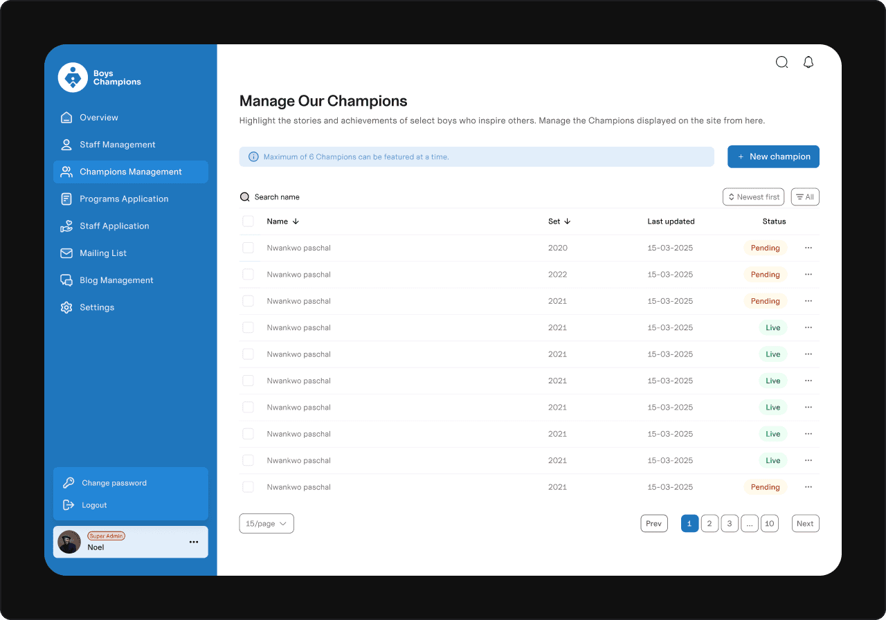
Work area

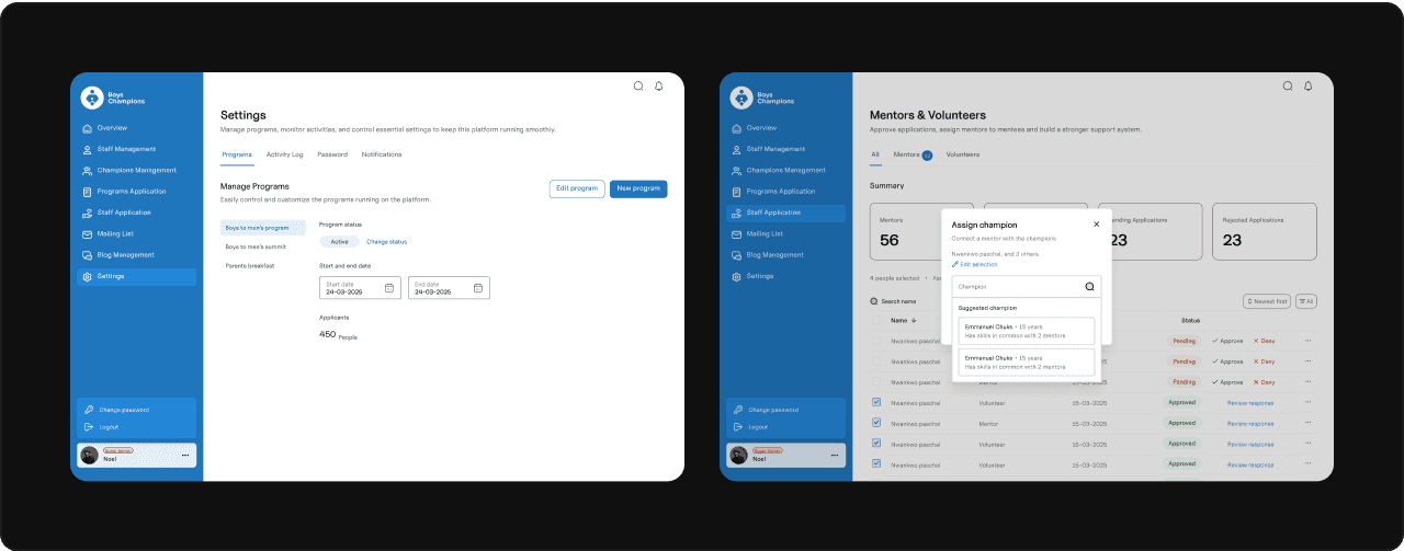
Some random screens


